Mastering UISwitch: The iOS Toggle Control for Swift Developers
The UISwitch is a fundamental UI control in iOS for allowing users to toggle between two states: on and off. This comprehensive guide covers integrating, customizing, and managing the state of UISwitch in your Swift applications, ensuring a robust and user-friendly experience.
Introduction to UISwitch
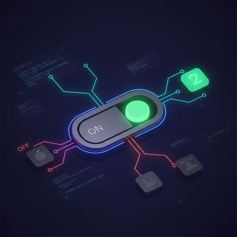
The UISwitch class is a standard control provided by Apple's UIKit framework, designed to let users make a binary choice. It visually represents two mutually exclusive states: 'on' (typically green) and 'off' (typically gray). You'll find UISwitch controls ubiquitously across iOS settings and app preferences, making them a well-recognized and intuitive component for users.
Understanding how to effectively implement and manage UISwitch is crucial for creating professional and user-friendly iOS applications. This article will guide you through its basic setup, customization options, and how to respond to user interactions in your Swift code.
Basic UISwitch Integration: Programmatic and Storyboard
You can integrate a UISwitch into your iOS application either programmatically in code or visually using Interface Builder (Storyboards or XIBs). Both methods are straightforward, and the choice often depends on your project's architecture and personal preference.
Programmatic Integration
To create a UISwitch programmatically, you simply instantiate it, define its frame, and add it to your view hierarchy. You can then set its initial state and add a target-action for value changes.
Handling UISwitch State and Actions
The primary property for managing UISwitch state is isOn. This boolean property directly reflects whether the switch is in its 'on' or 'off' position. You can read its value to determine the current state or set it to programmatically change the switch's position.
To respond to user interactions, UISwitch utilizes the target-action mechanism. When the user taps the switch, it sends a .valueChanged event. You register a target object (often your view controller) and a selector method to handle this event.
It's a good practice to always use sender.isOn within your action method, rather than relying on a stored property, to ensure you're getting the most up-to-date state of the control that triggered the event.
Compatibility Note: UISwitch has been available since iOS 2.0, so you don't need to worry about compatibility issues on modern iOS versions.
Customizing the Appearance of UISwitch
UISwitch offers several properties to customize its visual appearance, allowing it to better blend with your app's design language.
onTintColor: Changes the color of the switch when it's in the 'on' position.thumbTintColor: Changes the color of the circular 'thumb' that the user slides.tintColor: (iOS 6.0 and later) Changes the color of the switch's track when it's in the 'off' position. If not set, it defaults to clear or a light gray.onImageandoffImage: (iOS 6.0 and later) Allows you to set custom images to appear within the switch's track when it's on or off, respectively. These images are subtly displayed in the background of the track.
Be mindful that over-customizing can sometimes make the UISwitch less recognizable to users who are accustomed to the standard iOS look. Strive for a balance between aesthetics and usability.
Using UISwitch with UserDefaults for Persistence
Often, the state of a UISwitch needs to be persistent across app launches. For simple on/off preferences, UserDefaults is an excellent and easy-to-use solution. UserDefaults allows you to store small amounts of data (like booleans, strings, numbers) associated with your app.
When your view controller loads, you'll retrieve the saved state from UserDefaults and apply it to your UISwitch. Conversely, when the UISwitch's value changes, you'll save its new state back to UserDefaults.
Accessibility Considerations for UISwitch
Apple places a strong emphasis on accessibility, and UISwitch automatically handles many accessibility features out of the box. However, you can enhance the user experience for everyone, especially those using VoiceOver or Switch Control.
accessibilityLabel: Provide a concise, descriptive label for the switch's purpose (e.g., "Enable Notifications"). This is read aloud by VoiceOver.accessibilityValue: (Optional) VoiceOver will automatically announce 'on' or 'off' for a switch, but you can provide a more specific value if needed (e.g., "Notifications, currently enabled").accessibilityHint: Offer a brief instruction about what happens when the user interacts with the switch (e.g., "Toggles notifications on or off.").
By ensuring proper accessibility labels, you make your app usable and enjoyable for a wider audience.
Conclusion
The UISwitch is an essential building block for any iOS application requiring binary state selection. By mastering its integration, state management, customization, and accessibility features, you empower your users with clear, intuitive controls. Whether you're building a simple settings screen or a complex interactive interface, a well-implemented UISwitch contributes significantly to a polished and user-friendly experience. Continue to explore its capabilities and how it integrates with other UIKit components to build rich and engaging iOS applications.
Common Interview Questions
How do I get the current state of a UISwitch?
You can get the current state of a `UISwitch` by accessing its `isOn` boolean property. For example, `mySwitch.isOn` will return `true` if the switch is in the 'on' position and `false` if it is 'off'.
Can I prevent a UISwitch from changing its state temporarily?
Yes, you can. You can set the `isEnabled` property of the `UISwitch` to `false`. This will visually dim the switch and prevent user interaction. When `isEnabled` is `false`, the `valueChanged` event will not be triggered. Set it back to `true` to re-enable interaction.
What's the best practice for laying out a UISwitch alongside a label?
The most common and recommended practice is to use a `UIStackView` or define explicit Auto Layout constraints. Place the `UILabel` and the `UISwitch` side-by-side within a horizontal `UIStackView` for effortless spacing and alignment. Alternatively, you can constrain the label's leading edge to its superview and its trailing edge to the switch's leading edge, and then constrain the switch's trailing edge to the superview.